[ny] designlab: web design
client: Rebecca Edwards/Vassar College
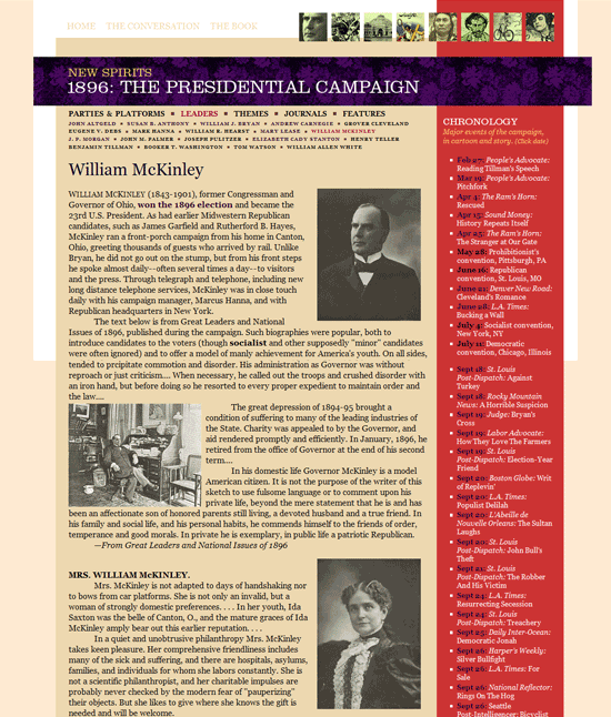
[designer’s comment] This website redesign for author, historian and professor Rebecca Edwards is a great example of how improving information architecture and navigation and integrating it with design and content can make a site alot easier and more enjoyable to use. Over the years she had collected many hundreds of historical documents and images as well as new writings, and she posted them at her old site online at Vassar—all of this became the starting place for the new site. We started by developing a new architecture for what is really several sites in one, with several different goals, including promotion of Edwards’ new book. The solution was to create an online “Conversation” in blog form for the new book, along with reviews and promotional material, and then to create a “Library” that would hold all of the other major web projects she had developed, including a major set of material on the 1896 Presidential campaign, the 1893 World’s Fair, The Making of Yellowstone Park and a series of Timelines for the period. In the new website, the navigation was drastically simplied—making the large amount of content feel more manageable to the reader; we also added some persistent, seemingly random picture links (at the top) which propel the casual reader into the various sections adding a fun surprise. The layout as well as the type and color styles are done as CSS in the templates and can add a 3-dimensional element to an otherwise strongly 2-D grid design. Where possible, large images coupled with strong headlines create a visual focus. Traditional print design elements like dropcaps followed by smallcaps introduce editorial with a sophistication not usually seen in web typography. The black and white images were blended with the background using a slight opacity, which game them a richer look.
[Tech note] For this site NYDL advised on URL naming, managed domain registration and hosting transfers, and then transitioned the site to the owner and her interns. The blog functionality was eventually turned off as not helpful and more work than time would allow the author; the design still holds up without it. The primary font used is Clarendon Light; the large italic is Cochin Italic. For a serious work like this, Georgia is the preferred text font—it is also one of the most readable online fonts and adds to the refined web typography that is a hallmark of NY DesignLab online graphic design.
[visit live site] Rebecca Edwards New Spirits website