[ny] designlab: web design
client: ibm
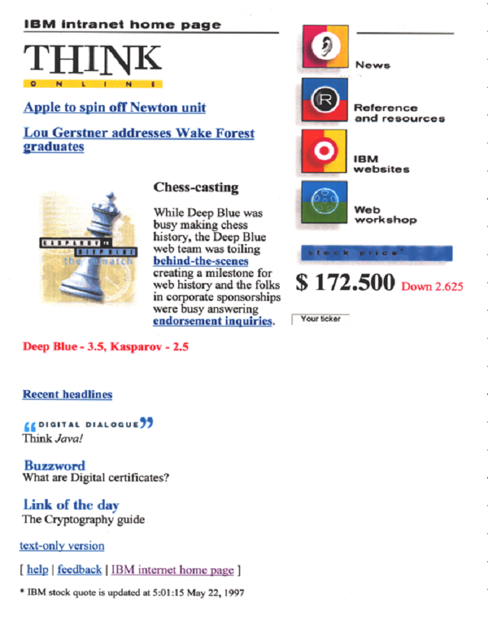
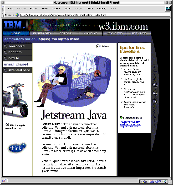
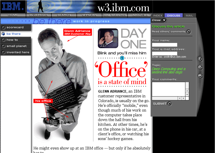
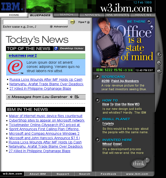
[producer’s comment] This redesign transformed IBM’s intranet into one of the world’s best. At the time, intranet sub-sites at IBM numbered in the hundreds, with minimal design or architectural standards—many of the sites known only within their small groups. The redesign approach was simple—unite all sub-sites under one master site with a powerful search engine—finally promoting knowledge sharing across the entire firm. The project was a close collaboration between the IBM team and consultants John Schmitz (strategy/information architecture) and Theo Fels (design) of Interactive Bureau. The project evolved in stages, gradually adding personalized news and an employee directory. This intranet, along with similar projects conducted with Microsoft and McKinsey Consulting, were some of the first and best intranet designs taking full advantage of the evolving internet browser—compare the “before” design below with the new design above. Typography: The primary font used in branding is Bauer Bodoni; the sans-serif font used in labeling is Helvetica Neue. Georgia and Arial/Helvetica are used as the text fonts.