[ny] designlab: logo design
client: Northern Dutchess Alliance
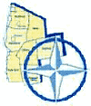
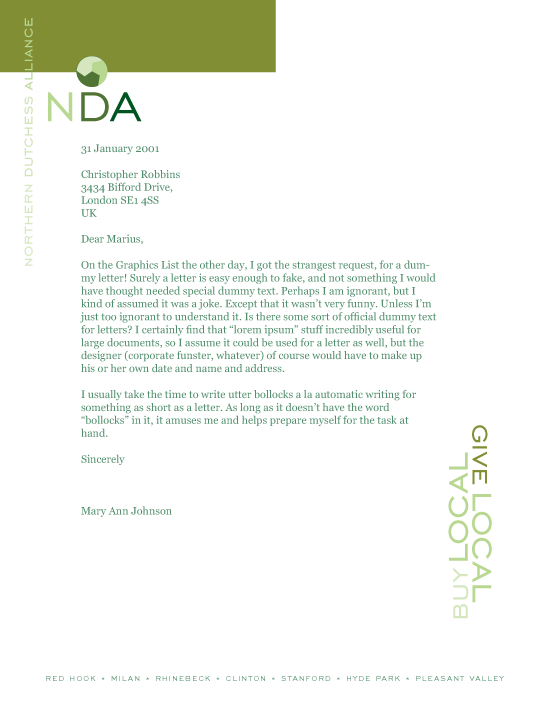
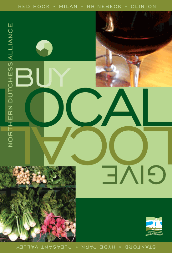
[designer’s comment] This branding makeover and new logo design was a natural evolution of an earlier large marketing design project for Northern Dutchess Alliance that included book design along with standard marketing design pieces like brochure, postcards and web site. The new logo was developed to match and complete the overall new “green” look, but also because the old logo (elements, below) is impractical—especially for online use; this logo is a clear example of trying to put too much into a logo—the result being that nothing comes across. A logo design needs to be clear, simple and direct—it should be a symbol, not an illustration. Several inspirations for this new logo were the globe of the Earth and the recycling symbol—NDA is an organization that exists to bring people together across the region. [typography] The primary font used is Bitstream’s version of Engravers Gothic.
[related work] Northern Dutchess Alliance web design