[ny] designlab: logo design
client: madalin hotel
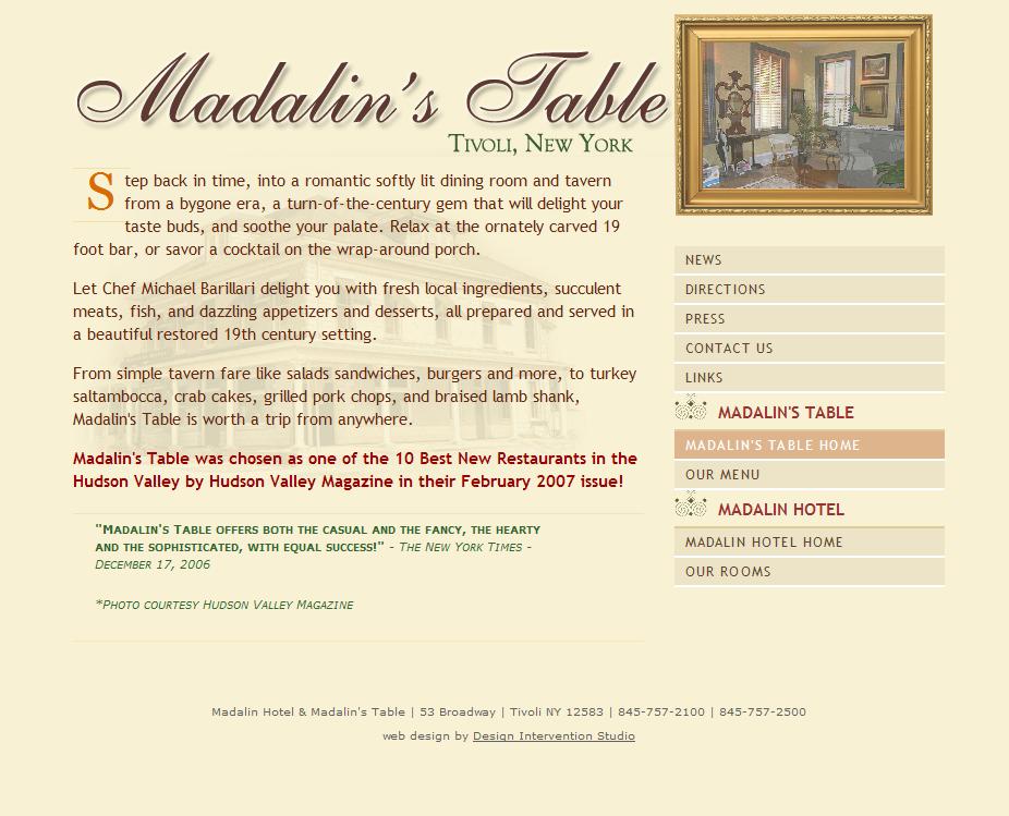
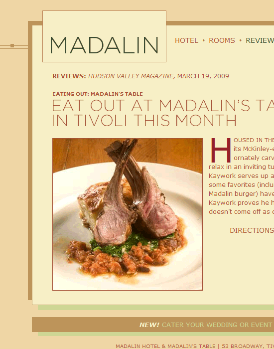
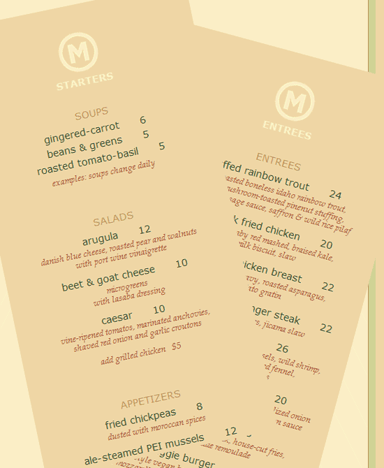
[designer’s comment] After this branding makeover, Madalin’s business improved—much of this increase in traffic was from the new website design. This logo redesign and update accompanied an overall rebranding project for Madalin Hotel and Restaurant, one of the Hudson Valley’s favorite spots located in Tivoli, NY. Out of the logo explorations came a new branding system, with logo design, graphic design for online and print marketing. The previous branding was old-fashioned and lacked the sophistication of the establishment—the new look is more elegant, upscale and direct, using cleaner and less fussy typography. In general, typography throughout the project is more refined, with more attentional to detail. The new naming shifts the primary branding to just “Madalin,” which is actually how the place is known. Content was also updated to reflectthe new branding—text copy was re-written and edited to be snappier; new photography was shot and existing photography was improved for a more professional look. The overall result is a more unique, branded and accessible experience for customers. [tech note] Initial printing shown here is straight color printing, however letter-printing or blind embossing the “circle M” would be appropriate and improve the brand image. [typography] The primary font used is Gotham.
[related work] Madalin web site design
[visit live site] Madalin Hotel & Restaurant website